Effective communication is the key to securing public sympathy and influence. Here, I’ve retold the story of how Marketing Magazine gave us a national award for best implementation of a new brand identity.
It’s 7.30am and I’m standing in the conference room at St Thomas’ Hospital in London. In an hour’s time, 200 delegates from all over the UK are going to come into the room as we relaunch the National Foster Care Association as the Fostering Network. Our beautiful height charts have been hand folded that morning to stop the ink smearing (yes, they’re that fresh). There’s just one problem left: the joiners who assembled the ‘wrap’ to go around the main speaker’s plinth put the hinges on back to front. We have a beautiful new logo, but it is pointed inwards towards the plinth, while the audience has a perfect few of some MDF and a couple of screws.
I think back nine short weeks to when I started work. My first job had been to convince the rest of the senior management team to go for the orange logo rather than the more conservative, but less surprising, purple house with a heart on it. It’s a truism that, faced with a new identity they weren’t expecting, employees react as if it was a tiger leaping out of the undergrowth to get them. Meanwhile, those we are seeking to influence are forever on the lookout for something different to grab their attention.
As the new boy, I carry a certain amount of influence and am able to carry the day. However, I get an inkling of the size of the task ahead of me when someone mentions that two of the people who founded the charity round a kitchen table in 1974 still work there. Proud of their achievements (and rightly so) they were concerned that the new identity might usher in some kind of hostile takeover of their cause.
This very understandable fear is more than matched by my own sense of lemming-like progress towards oblivion. “You want to launch the magazine as well?!!” You want to hand out a booklet explaining why we’ve changed our name?” “You want folders and a stage-set, a plinth-mount, new headed paper and and branded presentations?” “IN NINE WEEKS?!!!” Staff are equally aghast. Yet here we are. Job done. Almost
Stage one involved sitting down with our publications team. “It can’t be done,” they said. OK, I replied, but let’s just draw up a list of all the things we’d have to do to make it happen at some point in the future. We went through all the stages. Right, now you say we’d need to develop style sheets for the magazine – how long would that take? And we need to edit the text for the launch publication – can we do that in time?
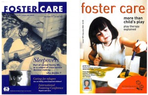
On and on we went, until we realised that we had precisely nine weeks to do nine weeks of work – no delays, no hiccups allowed.The scale of change was quite incredible. The charity had been founded at a time when most looked like extensions of government departments. Publications had blue covers and everything was conveyed using words; charities gave themselves long names with incomprehensible acronyms – the NCCL, the NFCA. The 21st century demanded something more immediate and comprehensible; NCCL became Liberty; we became the Fostering Network
Relentlessly, we advanced on our targets. The Powerpoint templates were easy so long as everyone stuck to the word counts (the text had to be readable by a middle-aged foster carer at a distance of 25 metres). But the launch publication was a nightmare. 2500 words and not one image to go with a new identity that was anchored in emotion. Somewhere along the line I’d had the idea of presenting it as a height chart – beautiful pictures on one side with space to record the height of different looked-after children; and on the other side, the story of the growth of the charity measured in years. But there was only room for 800 words. Editing was conducted on a needs-must basis; we got it down to 1100 and somehow made it fit, while the author wondered why we were slicing up a perfectly good text.
As the launch day approached, we heard that the 10,000 height charts we had ordered would not be machine foldable until the day after the conference. “What if we folded 200 by hand?” I asked – one for each delegate. Thus we found ourselves using plastic rulers to mark the folds, trying not to smear the ink as we went. Fatalism had by now given way to a sense of invincibility. We were surrounded by boxes of beautiful looking magazines, the stand was already in place. All we were waiting for was the plinth.
And so, at 7.30am I’m staring disaster in the face when David Riches – one of the best graphic designers I’ve ever worked with – bails me out. He’s shouting at the joiner on the phone. They’ll be here in 20 minutes. Oh, and here’s some white tape to cover up the screwholes.
Eight hours later it’s all over. My boss turns to me and says “Well, you can start thinking about next year now!” I’m thinking it was the hardest, but most exhilerating, race of my life to date.
Six months later David’s company – Visible Edge – got an award for best brand identity whlle we got one for best implementation at Marketing Magazine’s inaugural awards..
