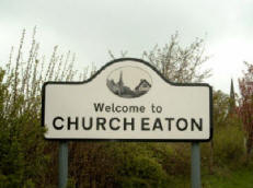
Why do village signs look the way they do? Too often, we allow them to brand villages as old-time, backwards-looking and conservative. Children are the losers.
Although the village in which I used to live is mentioned in the Domesday Book of 1086, it doesn’t have a village sign worthy of attention – just the rather drab municipal sign shown above. However, the village was awarded a grant to come up with something a bit better. I provided support along with a local stained-glass artist – Bob Thacker – to help our community participate in the design of the sign.
One of the most surprising discoveries of the process was that village signs are actually quite new. Although the iconography tends to be medieval, and village signs are seen as one of those eternal truths of rural life, they only became popular in the early 19th century. Up until that time people didn’t travel much, so there wasn’t much need to tell people where they were – they already knew.
The advent of mass travel led villagers to create ornate pictograms that were placed on a pole at the entrance to the village. The signs helped to embed an emerging sense of English national identity – images harked back to a idealised past featuring knights, geese, harvests and crests. And, like most great ideas, the village sign has now succeeded to such an extent that it is almost impossible to image an alternative form for them.
From a design perspective that makes things both easy and hard. When things are settled to the extent that they are unchallenged, people sometimes treat them as unchallengeable – as if someone has passed a decree stating that the design must forever remain unmodernised. Examples abound: cathedrals; cutlery; Parliament; schools. Rather than starting again with any of these, we pursue incremental development that leaves the core untouched. When the core design works (for instance in our system for measuring time) one might decide to leave well alone. But the fact of longevity should not be allowed to prevent even a consideration of alternatives, especially when the passage of time has brought into being ideas and tools that make the original concept seem incomplete.
Here are some of the problems that link village signs with rural isolation:
- If the format of the sign is regarded as unchallengable, then the likely consequence is that it will be backwards-looking rather than forwards-looking. This can result in children (particularly teenagers) feeling that the village belongs to another age group. Asking them to help draw it will not help: in ten years time all that will remain will be an image of a bygone era.
- We’ve discovered that while the over 40s like traditional village signs, the under 13s like totem poles telling the history of the village over generations. But opting for one over the other automatically creates winners and losers. We need a process that sets aside initial preferences and allows genuine merging of ideas to occur..
- The format and location of meetings is important. Most people are loath to attend anything that they perceive (rightly or wrongly) to be a rubber-stamping exercise. Bob put a major effort into inviting every person in the village to come along and consider alternatives.
- Our first session was held at the village institute, which is located at one end of the village. We will be doing follow up sessions in the pub (central) and school (age groups) to broaden participation. The process will change according to location, available time and age-group. Depending on the geography of any particular village, there may be questions over where to locate the sign. Our own discussions have revealed pockets of activity and inactivity across the village. There is a danger that this can translate into retrenchment, whereby new initiatives are placed at a distance from those who are not expected to use them. In the long term this can reinforce the non:-participative tendency of those who feel left out (even if others feel they are staying out).
- If the village sign is created as an aid to travellers it is effectively there as a service to people who don’t live in the village. By way of contrast, a sign that provides information on upcoming events, or which can double as a Maypole, can help to bring the community together.With all this in mind, I put together a presentation showing many different types of village sign, ranging from the traditional to the frankly conceptual. As well as the ‘pic on a pole’ it showed statues, totem poles, gangland graffiti and computer controlled signs that can point to any object in the universe. Local residents narrated each slide to demonstrate that it really is a community initiative.
- The participatory design process outlined in the presentation enables all the villagers to identify common values, consider alternative expressions of those values, consolidate ideas and settle on a finished design. Bob and I ran the first workshop and were delighted when just under 30 people (10% of the village) turned up over the course of three hours.
